Fluxon.Components.Alert (Fluxon v1.0.20)
A versatile alert component for displaying status messages, notifications, and interactive feedback. Built with accessibility and flexibility in mind, it provides a comprehensive solution for communicating important information through visually distinct and accessible alerts.
Flash Messages
The alert component is not intended to replace Phoenix's flash messages. For a similar aesthetic
in flash messages, it's recommended to apply the alert component's styles to the original
<.flash /> component.
Usage
The component can be used with simple text content for straightforward messages:
<.alert>Simple alert message</.alert>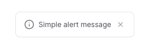
Visual Variants
The component supports different visual styles through the variant attribute, each designed
for specific types of messages:
<.alert variant="info" title="Update Available">
  A new version of the application is ready to install.
</.alert>

<.alert variant="success" title="Order Confirmed">
  Your order has been successfully processed.
</.alert>

<.alert variant="warning" title="Session Expiring">
  Your session will expire in 5 minutes.
</.alert>

<.alert variant="error" title="Connection Lost">
  Unable to connect to the server.
</.alert>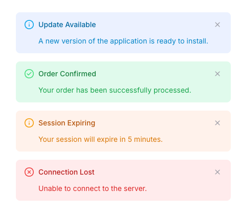
Each variant comes with its own color scheme and icon, optimized for both light and dark modes:
default: Neutral styling for general messagesinfo: Blue accents for informational messagessuccess: Green accents for success messageswarning: Amber accents for warning messageserror: Red accents for error messagesneutral: Gray styling for system messages
Content Structure
Alerts can display content in multiple ways to match your messaging needs:
Simple Text
For basic messages without additional context:
<.alert>Your changes have been saved.</.alert>With Title
For messages that need a clear heading:
<.alert title="Profile Updated">
  Your profile changes have been saved successfully.
</.alert>
With Title and Subtitle
For complex messages that need additional context:
<.alert
  title="Scheduled Maintenance"
  subtitle="System Update"
  variant="info">
  The system will be unavailable on Saturday from 2 AM to 4 AM.
</.alert>
Interactive Features
Dismissible Alerts
By default, alerts include a close button. This behavior can be customized:
<!-- Non-dismissible alert -->
<.alert hide_close>
  This alert cannot be dismissed
</.alert>

<!-- Custom close behavior -->
<.alert on_close={JS.push("handle_alert_close", value: %{id: @alert_id})}>
  This alert triggers a custom event when closed
</.alert>
Custom Actions
Alerts can include interactive elements for user actions:
<.alert
  variant="warning"
  title="Unsaved Changes"
  on_close={JS.push("dismiss_warning")}>
  You have unsaved changes that will be lost.

  <div class="mt-4 flex space-x-2">
    <.button size="xs">Save Changes</.button>
    <.button size="xs" variant="ghost">Discard</.button>
  </div>
</.alert>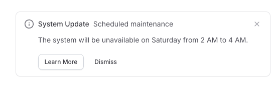
Icon Customization
The component provides flexibility in how icons are displayed:
<!-- No icon -->
<.alert hide_icon>
  Message without icon
</.alert>

<!-- Custom icon -->
<.alert>
  <:icon>
    <.icon name="hero-bell" class="size-5" />
  </:icon>
  Custom notification icon
</.alert>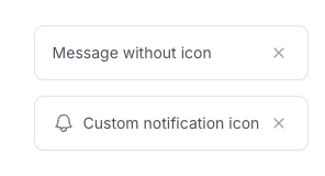
Summary
Components
Renders an alert component with support for various visual styles and interactive elements.
Components
Renders an alert component with support for various visual styles and interactive elements.
Attributes
id(:string) - The unique identifier for the alert element. If not provided, a random ID will be generated.class(:any) - Additional CSS classes to apply to the alert element. These are merged with the component's base classes and variant-specific styles.Defaults to
nil.title(:string) - The main heading text of the alert. When provided, creates a title section styled according to the chosen variant's color scheme.Defaults to
nil.subtitle(:string) - Secondary text displayed alongside the title. Only rendered when either title or subtitle is present.Defaults to
nil.variant(:string) - The visual style variant of the alert. Affects the entire component's appearance:default: White background with zinc accentsneutral: Light gray background with zinc accentserror: Light red background with red accentssuccess: Light green background with green accentsinfo: Light blue background with sky blue accentswarning: Light amber background with amber accents
Defaults to
"default".hide_icon(:boolean) - When true, hides the alert's status icon. Defaults tofalse.hide_close(:boolean) - When true, hides the alert's close button. Defaults tofalse.on_close(Phoenix.LiveView.JS) - LiveView JS commands to execute when the alert is closed. Defaults to%Phoenix.LiveView.JS{ops: []}.
Slots
inner_block- The main content to be displayed in the alert body. Renders with variant-specific text colors.icon- Optional custom icon to replace the default status icon. If not provided andhide_iconis false, a default icon based on the variant will be shown.