Fluxon.Components.Badge (Fluxon v1.0.20)
A versatile badge component for displaying status indicators, categories, and counts.
Badges are compact visual elements that help highlight information, categorize content, or show counts. They are designed to be highly visible while maintaining readability and can adapt their appearance for both light and dark modes.
Usage
Badges can be used to highlight status, categorize content, or display counts:
<.badge>Default</.badge>
<.badge color="blue">In Progress</.badge>
<.badge color="green">Completed</.badge>
<.badge color="red">Failed</.badge>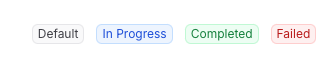
Colors and Theming
The badge component offers an extensive color palette optimized for both light and dark modes:
<.badge color="blue">Blue</.badge>
<.badge color="green">Green</.badge>
<.badge color="red">Red</.badge>
<.badge color="yellow">Yellow</.badge>
<.badge color="purple">Purple</.badge>
<.badge color="pink">Pink</.badge>
<.badge color="indigo">Indigo</.badge>
<.badge color="teal">Teal</.badge>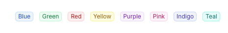
Each color includes carefully designed variations:
- Light mode: Semi-transparent background with matching ring
- Dark mode: Darker background with adjusted contrast
Available color spectrums:
- Base colors:
zinc(default) - Red spectrum:
red,rose,pink - Orange spectrum:
orange,amber - Yellow spectrum:
yellow - Green spectrum:
green,emerald,lime - Blue spectrum:
blue,sky,cyan - Purple spectrum:
purple,violet,indigo - Special colors:
fuchsia,teal
Visual Variants
The component offers three distinct visual styles:
<.badge variant="default">Default Badge</.badge>
<.badge variant="pill">Pill Badge</.badge>
<.badge variant="flat">Flat Badge</.badge>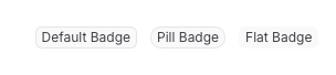
Working with Icons
Badges work seamlessly with icons for enhanced visual communication. The component automatically
handles icon sizing and alignment through the icon class:
<.badge color="green">
  <.icon name="hero-check-circle" class="icon" /> Verified
</.badge>

<.badge color="amber">
  <.icon name="hero-clock" class="icon" /> Pending
</.badge>

<.badge color="red">
  <.icon name="hero-x-circle" class="icon" /> Failed
</.badge>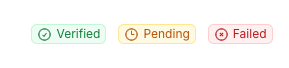
Icon Class Required
The icon class is required for proper icon sizing and alignment within badges:
<.badge>
  <.icon name="hero-check" class="icon" /> <!-- Correct -->
  <.icon name="hero-check" /> <!-- Incorrect -->
</.badge>
Real-World Examples
Status Indicators
<.badge color="green" variant="pill">Active</.badge>
<.badge color="amber" variant="pill">Pending</.badge>
<.badge color="red" variant="pill">Inactive</.badge>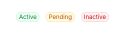
Category Labels
<.badge color="blue" variant="flat">Documentation</.badge>
<.badge color="purple" variant="flat">Feature</.badge>
<.badge color="orange" variant="flat">Bug Fix</.badge>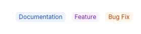
Notification Counts
<.badge color="red" variant="pill">99+</.badge>
<.badge color="blue" variant="pill">New</.badge>
<.badge color="green" variant="pill">4</.badge>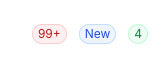
Summary
Components
Renders a badge component with the given attributes and content.
Components
Renders a badge component with the given attributes and content.
The badge component provides a flexible way to highlight information through visual indicators. It supports various styles, colors, and can contain both text and icons.
Attributes
class(:any) - Additional CSS classes to apply to the badge element. These are merged with the component's base classes, variant styles, and color styles.Defaults to
nil.color(:string) - The color scheme of the badge. Each color includes light and dark mode variants that affect the background, text, and ring colors.Defaults to
"zinc".variant(:string) - The visual style variant of the badge:default: Standard rounded corners with ringpill: Fully rounded edges for a softer lookflat: Similar to default but without ring/border
Defaults to
"default".Global attributes are accepted. Additional HTML attributes to apply to the badge element.
Slots
inner_block(required) - The content to be displayed within the badge. Supports text and icons with automatic spacing and alignment.