Fluxon.Components.Checkbox (Fluxon v1.0.20)
A versatile checkbox component for capturing single and multiple selections.
This component provides a comprehensive solution for building accessible form inputs, selection interfaces, and rich interactive content. It seamlessly integrates with Phoenix forms and offers both standard and card variants to accommodate various design patterns, from simple boolean toggles to visually rich selection interfaces.
Usage
The checkbox component can be used in its simplest form for single selections:
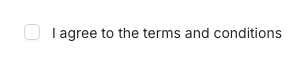
<.checkbox
  name="terms"
  label="I agree to the terms and conditions"
  value="accepted"
/>
The checkbox value will be "true" when checked and "false" when unchecked.
%{"_target" => ["terms"], "terms" => "true"}
%{"_target" => ["terms"], "terms" => "false"}
For more context, you can add sublabels and descriptions:
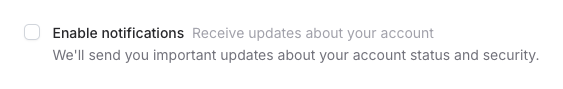
<.checkbox
  name="notifications"
  label="Enable notifications"
  sublabel="Receive updates about your account"
  description="We'll send you important updates about your account status and security."
/>
Form Integration
The checkbox component offers two ways to handle form data: using the field attribute for Phoenix form integration
or using the name attribute for standalone checkboxes. Each approach has its own benefits and use cases.
Using with Phoenix Forms (Recommended)
When working with Phoenix forms, use the field attribute to bind the checkbox to a form field:
<.form :let={f} for={@form} phx-change="validate" phx-submit="save">
  <.checkbox
    field={f[:marketing_emails]}
    label="Marketing emails"
    sublabel="Receive updates about new features and promotions"
  />

  <.checkbox
    field={f[:terms_accepted]}
    label="Terms and Conditions"
    description="I agree to the terms of service and privacy policy"
    value="accepted"
  />

  <.checkbox
    field={f[:newsletter_frequency]}
    label="Weekly newsletter"
    value="weekly"
    checked={@user.newsletter_frequency == "weekly"}
  />
</.form>
Using the field attribute provides several advantages:
- Automatic value handling from the form data
- Built-in error handling and validation messages
- Proper form submission with correct field names
- Integration with changesets for data validation
- Automatic ID generation for accessibility
- Proper handling of nested form data
The component will automatically:
- Set the checkbox field's name based on the form structure
- Display the current value from the form data
- Show validation errors when present
- Handle nested form data with proper input naming
Using Standalone Checkboxes
For simpler cases or when not using Phoenix forms, use the name attribute:
<.checkbox
  name="show_archived"
  checked={@show_archived}
  label="Show archived items"
/>

<.checkbox
  name="user[preferences][dark_mode]"
  checked={@user_preferences.dark_mode}
  errors={@errors["dark_mode"]}
  label="Dark mode"
  sublabel="Use dark theme"
/>
When using standalone checkboxes:
- You must provide the
nameattribute - Values must be managed manually via the
checkedattribute - Errors must be passed explicitly via the
errorsattribute - Form submission handling needs to be implemented manually
- Nested data requires manual name formatting (e.g.,
user[preferences][dark_mode])
When to use each approach
Use the field attribute when:
- Working with changesets and data validation
- Handling complex form data structures
- Need automatic error handling
- Building CRUD interfaces
Use the name attribute when:
- Building simple toggle controls
- Creating standalone filters
- Handling one-off form controls
- Need more direct control over the checkbox behavior
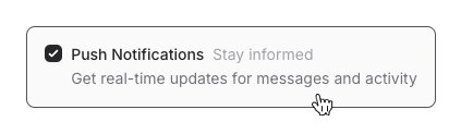
Card Variant
The component offers a card variant that transforms checkboxes into rich, interactive selection cards:
 <.checkbox
    control="left"
    field={f[:notifications]}
    variant="card"
    label="Push Notifications"
    sublabel="Stay informed"
    description="Get real-time updates for messages and activity"
    value="enabled"
  />
Checkbox Group
Checkbox groups are used to map a list of options to a single form field:
<.checkbox_group
  name="preferences"
  label="Notification Preferences"
  description="Choose when you want to receive notifications"
>
  <:checkbox value="email" label="Email notifications" />
  <:checkbox value="push" label="Push notifications" />
  <:checkbox value="sms" label="SMS notifications" />
</.checkbox_group>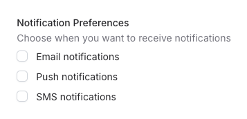
Form Integration
Like the single checkbox component, checkbox groups seamlessly integrate with Phoenix forms. See the form integration section in the Form Integration section for a detailed guide on form handling.
Here's a simple example using the field attribute:
<.form :let={f} for={@form} phx-change="validate" phx-submit="save">
  <.checkbox_group
    field={f[:notification_preferences]}
    label="Notification Preferences"
    description="Choose how you want to be notified"
  >
    <:checkbox value="email" label="Email" sublabel="Get notified via email" />
    <:checkbox value="push" label="Push" sublabel="Receive push notifications" />
    <:checkbox value="sms" label="SMS" sublabel="Get SMS alerts" />
  </.checkbox_group>
</.form>
Different from the single checkbox, the group will send a list of selected values in the form submission:
%{"_target" => ["preferences"], "preferences" => ["", "email", "push"]}Empty Values in Checkbox Groups
When working with checkbox groups, it's important to understand how browsers handle unselected checkboxes:
- By HTML specification, browsers only submit values for checked checkboxes
- If no checkboxes are selected, the field will be completely absent from the form data
To ensure consistent form handling, this component includes a hidden input with an empty value:
<input type="hidden" name="group[]" value="" />This means your form submissions will always include the field, with these possible values:
# No checkboxes selected
%{"group" => [""]}

# One or more selected
%{"group" => ["", "option1", "option2"]}
When processing the form data, you'll want to:
- Filter out the empty string value
- Handle an empty list as "no selection"
# Example processing
selected = Enum.reject(params["group"] || [], &(&1 == ""))
Card Variant
The card variant transforms checkboxes into rich, interactive selection cards:
<.checkbox_group
  label="Weekdays"
  description="Select the days of the week you want to work"
  field={f[:weekdays]}
  variant="card"
  class="flex gap-x-2"
>
  <:checkbox
    :for={{label, value} <- [{"S", "sun"}, {"M", "mon"}, {"T", "tue"}, {"W", "wed"}, {"T", "thu"}, {"F", "fri"}, {"S", "sat"}]}
    value={value}
    class="flex items-center justify-center rounded-full has-[:checked]:bg-zinc-800 text-zinc-700 has-[:checked]:text-white size-10"
  >
    <span class="text-sm font-medium">{label}</span>
  </:checkbox>
</.checkbox_group>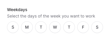
Summary
Components
Renders a single checkbox input for capturing boolean or single-value selections.
Renders a checkbox group for managing multiple related selections.
Components
Renders a single checkbox input for capturing boolean or single-value selections.
This component provides a flexible way to build form inputs with support for labels, descriptions, and rich styling options. It includes built-in form integration, error handling, and accessibility features.
Attributes
id(:any) - The unique identifier for the checkbox. When not provided, a random ID will be generated. Defaults tonil.name(:any) - The form name for the checkbox. Required when not using thefieldattribute.checked(:boolean) - Whether the checkbox is checked. When using forms, this is automatically handled by thefieldattribute.value(:any) - The value associated with the checkbox. This value is submitted when the checkbox is checked.errors(:list) - List of error messages to display below the checkbox. These are automatically handled when using thefieldattribute with form validation.Defaults to
[].label(:string) - The primary label for the checkbox. This text is displayed next to the checkbox and is used for accessibility purposes.Defaults to
nil.sublabel(:string) - Additional context displayed to the side of the main label. Useful for providing extra information without cluttering the main label.Defaults to
nil.description(:string) - Detailed description of the checkbox option. This text appears below the label and can contain longer explanatory text.Defaults to
nil.class(:any) - Additional CSS classes to apply to the checkbox. Useful for controlling the appearance of the checkbox.Defaults to
nil.field(Phoenix.HTML.FormField) - The form field to bind to. When provided, the component automatically handles value tracking, errors, and form submission.variant(:string) - The visual variant of the checkbox. Currently supports:nil(default): Standard checkbox with label"card": Rich selection card with support for custom content
Defaults to
nil.control(:string) - Controls the position of the checkbox input in card variants. It's only available whenvariant="card"."left": Places the checkbox on the left side of the card"right": Places the checkbox on the right side of the card Must be one of"left", or"right".
Global attributes are accepted. Additional HTML attributes to apply to the checkbox input. Currently supports the
disabledattribute. Supports all globals plus:["disabled"].
Slots
inner_block- Optional custom content for the checkbox. When provided in card variants, this content replaces the standard label/sublabel/description structure.
Renders a checkbox group for managing multiple related selections.
This component provides a flexible way to handle multiple choice selections, with support for both standard checkbox lists and rich card-based interfaces. It includes built-in form integration, error handling, and accessibility features.
Attributes
id(:any) - The unique identifier for the checkbox group. When not provided, a random ID will be generated. Defaults tonil.name(:string) - The form name for the checkbox group. For groups, this will be suffixed with[]to support multiple selections. Required when not using thefieldattribute.value(:any) - The current value(s) of the checkbox group. For groups, this should be a list of selected values. When using forms, this is automatically handled by thefieldattribute.label(:string) - The primary label for the checkbox group. This text is displayed above the checkboxes and is used for accessibility purposes.Defaults to
nil.sublabel(:string) - Additional context displayed on the side of the main label. Useful for providing extra information about the checkbox group without cluttering the main label.Defaults to
nil.description(:string) - Detailed description of the checkbox group. This text appears below the label and can contain longer explanatory text about the available options.Defaults to
nil.errors(:list) - List of error messages to display below the checkbox group. These are automatically handled when using thefieldattribute with form validation.Defaults to
[].class(:any) - Additional CSS classes to apply to the checkbox group container. Useful for controlling layout, spacing, and visual styling of the group.Defaults to
nil.field(Phoenix.HTML.FormField) - The form field to bind to. When provided, the component automatically handles value tracking, errors, and form submission.disabled(:boolean) - When true, disables all checkboxes in the group. Disabled checkboxes cannot be interacted with and appear visually muted.Defaults to
false.variant(:string) - The visual variant of the checkbox group. Currently supports:nil(default): Standard stacked checkboxes"card": Rich selection cards with support for custom content
Defaults to
nil.control(:string) - Controls the position of the checkbox input in card variants. It's only available whenvariant="card"."left": Places the checkbox on the left side of the card"right": Places the checkbox on the right side of the card Must be one of"left", or"right".
Slots
checkbox(required) - Defines the individual checkboxes within the group. Each checkbox can have:value: The value associated with this checkboxlabel: The checkbox labelsublabel: Additional context on the side of the labeldescription: Detailed description of the optiondisabled: Whether this specific checkbox is disabledclass: Additional CSS classes for this checkboxchecked: Whether this checkbox should be checked by default
value(:any) (required)label(:string)sublabel(:string)description(:string)disabled(:boolean)class(:any)checked(:boolean)