Fluxon.Components.Dropdown (Fluxon v1.0.20)
A comprehensive dropdown system for creating accessible, interactive menus and selection interfaces.
This component provides a flexible solution for building dropdown menus across your application. It offers a fully accessible implementation with keyboard navigation, automatic positioning, and proper focus management. The component is designed to work seamlessly with LiveView while maintaining proper accessibility standards.
Usage
Create a simple dropdown menu with default styling:
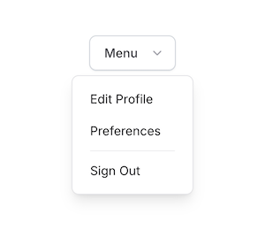
<.dropdown>
  <.dropdown_link navigate={~p"/profile"}>Profile</.dropdown_link>
  <.dropdown_link navigate={~p"/settings"}>Settings</.dropdown_link>
  <.dropdown_separator />
  <.dropdown_link href={~p"/logout"} method="delete">Sign Out</.dropdown_link>
</.dropdown>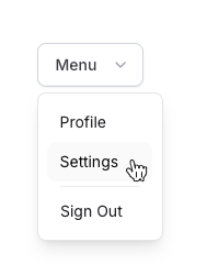
Custom Toggle
Replace the default button with a custom toggle element:
<.dropdown>
  <:toggle>
    <button class="flex items-center gap-x-2 bg-zinc-200/50 rounded-lg p-2">
      <img src={~p"/images/human-avatar-01.png"} alt="User" class="size-6 rounded-lg" />
      <div class="text-sm text-gray-800 font-semibold dark:text-gray-200">John Doe</div>
      <.icon name="u-chevron-down" class="size-4" />
    </button>
  </:toggle>
  <.dropdown_button>Profile</.dropdown_button>
  <.dropdown_button>Billing</.dropdown_button>
  <.dropdown_button>Settings</.dropdown_button>
</.dropdown>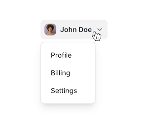
Rich Content
Create complex dropdown interfaces with headers, separators, and custom content:
<.dropdown class="w-64">
  <.dropdown_custom class="flex items-center p-2">
    <img src="https://i.pravatar.cc/150?u=1" alt="Avatar" class="size-9 rounded-full" />
    <div class="flex flex-col ml-3">
      <span class="text-sm font-medium">Emma Johnson</span>
      <span class="text-xs text-zinc-500">emma@acme.com</span>
    </div>
  </.dropdown_custom>

  <.dropdown_separator />

  <.dropdown_header>Account</.dropdown_header>
  <.dropdown_link navigate={~p"/profile"}>Profile</.dropdown_link>
  <.dropdown_link navigate={~p"/billing"}>Billing</.dropdown_link>

  <.dropdown_header>Support</.dropdown_header>
  <.dropdown_link navigate={~p"/help"}>Documentation</.dropdown_link>
  <.dropdown_link navigate={~p"/contact"}>Contact Us</.dropdown_link>

  <.dropdown_separator />

  <.dropdown_link href={~p"/logout"} method="delete" class="text-red-600">
    Sign Out
  </.dropdown_link>
</.dropdown>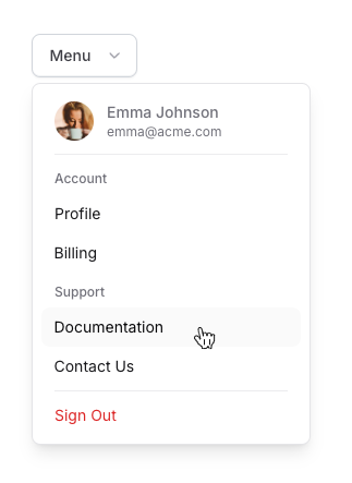
Hover Interaction
Enable hover-based opening with custom delays:
<.dropdown open_on_hover hover_open_delay={200} hover_close_delay={300}>
  <.dropdown_link navigate={~p"/profile"}>Profile</.dropdown_link>
  <.dropdown_link navigate={~p"/settings"}>Settings</.dropdown_link>
</.dropdown>
Menu Positioning
Control the dropdown's placement relative to its toggle:
<.dropdown placement="bottom-end">
  <.dropdown_link>Bottom End Aligned</.dropdown_link>
</.dropdown>

<.dropdown placement="right-start">
  <.dropdown_link>Right Side Menu</.dropdown_link>
</.dropdown>
Custom Animations
Customize the dropdown's enter/leave animations:
<.dropdown
  animation="transition-all duration-300"
  animation_enter="opacity-100 translate-y-0"
  animation_leave="opacity-0 -translate-y-2"
>
  <.dropdown_link>Smooth Slide Animation</.dropdown_link>
</.dropdown>
Keyboard Navigation
The component provides comprehensive keyboard support following ARIA best practices:
| Key | Element Focus | Description |
|---|---|---|
Tab/Shift+Tab | Toggle button | Moves focus to and from the dropdown toggle |
Space/Enter | Toggle button | Opens/closes the dropdown when focused |
↑ | Toggle button | Opens dropdown and highlights last item |
↓ | Toggle button | Opens dropdown and highlights first item |
↑ | Menu item | Moves highlight to previous item |
↓ | Menu item | Moves highlight to next item |
Enter/Space | Menu item | Activates the highlighted item |
Escape | Any | Closes the dropdown |
Focus Management
The dropdown implements sophisticated focus management to ensure a seamless user experience. Focus remains on the toggle button while users navigate through menu items using arrow keys. Menu items are not focusable through tab navigation, maintaining a streamlined keyboard interaction model. The component manages proper ARIA attributes to communicate the current selection to assistive technologies.
Positioning System
The dropdown menu intelligently positions itself relative to its toggle button. It automatically adjusts its placement based on available viewport space, ensuring optimal visibility regardless of the toggle button's position. The positioning system handles window resizing and scrolling, maintaining proper alignment in dynamic layouts.
Summary
Components
Renders a fully accessible dropdown menu with rich interaction support.
Renders a dropdown button item.
Renders a custom content area within the dropdown menu.
Renders a dropdown header.
Renders a dropdown link item.
Renders a dropdown separator.
Components
Renders a fully accessible dropdown menu with rich interaction support.
This component provides a flexible way to create dropdown menus with proper keyboard navigation, focus management, and positioning. It supports both click and hover interactions, custom toggle elements, and various animation options.
Attributes
id(:string) - The unique identifier for the dropdown component. If not provided, one will be automatically generated.label(:string) - The text label for the default dropdown toggle button. Only used when no custom toggle is provided via the:toggleslot.Defaults to
"Menu".class(:any) - Additional CSS classes for the dropdown menu panel. Useful for controlling width, max-height, and other menu-specific styles.Defaults to
nil.container_class(:string) - Additional CSS classes for the dropdown's outer container. Affects the positioning wrapper element.Defaults to
nil.toggle_class(:string) - Additional CSS classes for the dropdown toggle button. Only applies to the default toggle button, not custom toggles.Defaults to
nil.disabled(:boolean) - When true, disables the dropdown toggle and prevents the menu from opening. Defaults tofalse.placement(:string) - Controls the placement of the dropdown menu relative to its toggle button. Supports different positions with automatic repositioning when needed.The possible values are:
top,top-start,top-end,right,right-start,right-end,bottom,bottom-start,bottom-end,left,left-start,left-endDefaults to
"bottom-start".animation(:string) - Base animation classes applied to the dropdown menu. Controls the transition timing and easing function.Defaults to
"transition ease-in-out duration-150".animation_enter(:string) - Classes applied when the dropdown menu enters. Usually defines the final state of the animation.Defaults to
"opacity-100 scale-100".animation_leave(:string) - Classes applied when the dropdown menu leaves. Usually defines the initial state of the exit animation.Defaults to
"opacity-0 scale-95".open_on_hover(:boolean) - When true, opens the dropdown menu on mouse hover instead of click. Can be combined with hover delays for better user experience.Defaults to
false.hover_open_delay(:integer) - Delay in milliseconds before opening the menu when hovering. Only applies whenopen_on_hoveris true.Defaults to
0.hover_close_delay(:integer) - Delay in milliseconds before closing the menu when mouse leaves. Only applies whenopen_on_hoveris true.Defaults to
0.
Slots
inner_block(required) - The content of the dropdown menu. Usually containsdropdown_link,dropdown_button, or other dropdown components.toggle- Optional custom toggle element. When provided, replaces the default button toggle while maintaining proper accessibility attributes.Accepts attributes:
class(:any) - Additional CSS classes for the wrapper of the custom toggle element.
Renders a dropdown button item.
A dropdown button is an interactive item within the dropdown menu that triggers an action
rather than navigating to a new page. It renders as a <button> element, making it ideal
for handling click events or other interactive behaviors.
- Renders as a
<button type="button">element - Styled consistently with other dropdown items
- Supports Phoenix LiveView event bindings (e.g.,
phx-click) - Accessible, with appropriate ARIA attributes for menu interaction
- Useful for actions that don't involve page navigation
Attributes
class(:any) - Additional CSS classes for the button element. The new classes will be merged with the default styles. Defaults tonil.- Global attributes are accepted. Additional HTML attributes to apply to the button element. Useful for adding event handlers or data attributes.
Slots
inner_block(required) - The content of the button item. Usually contains text but can include icons or other elements.
Examples
<.dropdown_button phx-click={JS.push("update-view", value: %{view: "grid"})}>
  Grid
</.dropdown_button>

<.dropdown_button phx-click="update-view" phx-value-view="list">
  List
</.dropdown_button>

<.dropdown_button phx-click={Fluxon.open_dialog("new-user-dialog")}>
  New User
</.dropdown_button>Renders a custom content area within the dropdown menu.
This function allows you to insert arbitrary content into the dropdown menu that is not treated as a standard menu item. It provides a flexible space where you can add any HTML elements or components, such as buttons, texts, or complex interactive elements.
- Not treated as a navigable menu item in the dropdown's keyboard navigation flow.
- Can contain focusable elements that are still accessible via tab navigation.
- Useful for adding non-standard content or functionality to your dropdown menu.
Attributes
class(:any) - Additional CSS classes for the custom content container. The new classes will be merged with the default styles. Defaults tonil.- Global attributes are accepted. Additional HTML attributes to apply to the custom content container.
Slots
inner_block(required) - The custom content to be rendered. Can contain any HTML or components for creating complex dropdown items.
Examples
<.dropdown_custom class="flex items-center p-2">
  <img src="https://i.pravatar.cc/150?u=1" alt="Avatar" class="size-9 rounded-full" />
  <div class="flex flex-col ml-3 mr-10">
    <span class="text-sm font-medium leading-snug">Emma Johnson</span>
    <span class="text-xs text-zinc-500 leading-snug">emma@acme.com</span>
  </div>
  <.badge color="red" class="ml-auto">PRO</.badge>
</.dropdown_custom>

<.dropdown_custom class="flex items-center gap-x-10 bg-zinc-100/70 rounded-lg p-2">
  <div class="flex flex-col">
    <span class="text-sm font-medium">Available Tokens</span>
    <span class="text-sm text-zinc-500">Only 75 tokens available</span>
  </div>
  <.button size="xs" class="ml-auto">Manage</.button>
</.dropdown_custom>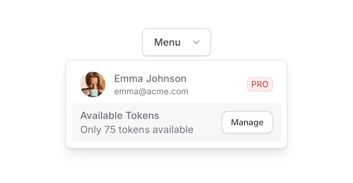
Renders a dropdown header.
A dropdown header is used to visually group and label sections of menu items within a dropdown. It provides a non-interactive title or category for a set of related menu options.
- Adds a visual separator and title to group related menu items
- Not a navigable or selectable item in the dropdown menu
- Typically styled differently from regular menu items (e.g., smaller font, different color)
Attributes
class(:any) - Additional CSS classes for the header element. The new classes will be merged with the default styles. Defaults tonil.- Global attributes are accepted. Additional HTML attributes to apply to the header element.
Slots
inner_block(required) - The content of the header. Usually contains text but can include other elements for complex headers.
Examples
<.dropdown_header>Account Settings</.dropdown_header>
<.dropdown_link patch={~p"/profile"}>Edit Profile</.dropdown_link>
<.dropdown_link patch={~p"/settings"}>Preferences</.dropdown_link>

<.dropdown_header>Help & Support</.dropdown_header>
<.dropdown_link navigate={~p"/faq"}>FAQ</.dropdown_link>
<.dropdown_link navigate={~p"/contact"}>Contact Us</.dropdown_link>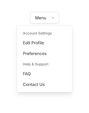
Renders a dropdown link item.
A dropdown link is a navigable item within the dropdown menu. It renders as a <.link> component,
which means it supports both standard HTML link attributes and LiveView-specific navigation options.
- Supports LiveView navigation with
navigateandpatchattributes - Can be used with standard
hreffor regular link behavior - Styled consistently with other dropdown items
- Accessible, with appropriate ARIA attributes for menu interaction
Attributes
class(:any) - Additional CSS classes for the link element. The new classes will be merged with the default styles. Defaults tonil.- Global attributes are accepted. Additional HTML attributes for the link element. Supports both standard
anchor attributes and LiveView navigation options.
Supports all globals plus:
["navigate", "patch", "href", "replace", "method", "csrf_token", "download", "hreflang", "referrerpolicy", "rel", "target", "type"].
Slots
inner_block(required) - The content of the link item. Usually contains text but can include icons or other elements.
Examples
<.dropdown_link navigate={~p"/dashboard"}>
  Dashboard
</.dropdown_link>

<.dropdown_link patch={~p"/settings"}>
  Settings
</.dropdown_link>

<.dropdown_link href="https://example.com" target="_blank">
  External Link
</.dropdown_link>Renders a dropdown separator.
A separator is essentially a horizontal line that divides dropdown menu items, providing visual separation between groups of options.
Attributes
class(:any) - Additional CSS classes for the separator element. The new classes will be merged with the default styles. Defaults tonil.- Global attributes are accepted. Additional HTML attributes to apply to the separator element.
Examples
<.dropdown_link patch={~p"/profile"}>Edit Profile</.dropdown_link>
<.dropdown_link patch={~p"/settings"}>Preferences</.dropdown_link>
<.dropdown_separator />
<.dropdown_link href={~p"/sign_out"} method="delete">Sign Out</.dropdown_link>