Fluxon.Components.Form (Fluxon v1.0.20)
A collection of form-related components for building accessible and consistent form interfaces.
This module provides essential form components that work together to create cohesive form experiences. It includes components for labels, error messages, and other form-related elements, all designed with accessibility and user experience in mind.
Summary
Components
Renders an error message with an optional warning icon.
Renders a form label with optional sublabel and description.
Components
Renders an error message with an optional warning icon.
This component provides consistent error message styling with an optional icon. It's designed to work seamlessly with form validation and can be used both within and outside of forms.
Attributes
icon(:boolean) - Controls the visibility of the warning icon. When true, displays a warning icon before the error message.Defaults to
true.class(:any) - Additional CSS classes to apply to the error message container. Useful for customizing the appearance and layout of error messages.Defaults to
nil.
Slots
inner_block(required) - The error message content. This is the text that describes the error condition.
Examples
Basic error message:
<.error>This field is required</.error>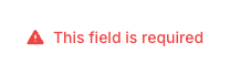
Error without icon:
<.error icon={false}>
  Password must be at least 8 characters long
</.error>
Custom styling:
<.error class="mt-4">
  Please fix the errors above before continuing
</.error>Renders a form label with optional sublabel and description.
This component provides a standardized way to label form inputs with support for additional context through sublabels and descriptions. It automatically integrates with Phoenix form fields and maintains proper accessibility relationships.
Attributes
for(:any) - The ID of the form control this label is associated with. When used with Phoenix form fields, this is automatically set to the field's ID.Defaults to
nil.class(:any) - Additional CSS classes to apply to the label element. Useful for controlling the appearance and layout of the label.Defaults to
nil.description(:string) - Detailed description text that appears below the label. This text provides additional context about the form field being labeled.Defaults to
nil.sublabel(:string) - Additional text displayed next to the main label. Useful for providing supplementary information like field requirements or constraints.Defaults to
nil.Global attributes are accepted. Additional HTML attributes to be applied to the label element.
Slots
inner_block(required) - The main label text content. This is the primary text that describes the form field.
Examples
Basic label with sublabel:
<.label for="email" sublabel="Required" description="We'll never share your email">
  Email Address
</.label>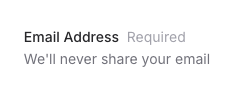
Integration with Phoenix form fields:
<.form :let={f} for={@changeset} phx-submit="save">
  <.label for={f[:email]} sublabel="We'll never share your email">
    Email Address
  </.label>

  <.input field={f[:email]} type="email" />
</.form>