Fluxon.Components.Input (Fluxon v1.0.20)
A versatile input component that provides a comprehensive solution for text entry, search fields, and form controls.
This component offers a rich set of features including input accessories (prefixes and suffixes), various size variants, and seamless integration with Phoenix forms. It's designed to handle common input patterns while maintaining accessibility and providing a consistent user experience.
Usage
The input component can be used in its simplest form:
<.input name="username" label="Username" />
<.input name="password" type="password" label="Password" />
<.input name="email" type="email" label="Email" />
Size Variants
The component offers four size variants to accommodate different design needs:
<.input name="input" size="sm" placeholder="Small input" />
<.input name="input" size="base" placeholder="Base input" />
<.input name="input" size="lg" placeholder="Large input" />
<.input name="input" size="xl" placeholder="Extra large input" />
Form Integration
The input component offers two ways to handle form data: using the field attribute for Phoenix form integration
or using the name attribute for standalone inputs. Each approach has its own benefits and use cases.
Using with Phoenix Forms (Recommended)
When working with Phoenix forms, use the field attribute to bind the input to a form field:
<.form :let={f} for={@form}>
  <.input field={f[:email]} type="email" label="Email" />
  <.input field={f[:password]} type="password" label="Password" />
</.form>
Using the field attribute provides several advantages:
- Automatic value handling from the form data
- Built-in error handling and validation messages
- Proper form submission with correct field names
- Integration with changesets for data validation
- Automatic ID generation for accessibility
- Proper handling of nested form data
The component will automatically:
- Set the input's name based on the form structure
- Display the current value from the form data
- Show validation errors when present
- Handle nested form data with proper input naming
Using Standalone Inputs
For simpler cases or when not using Phoenix forms, use the name attribute:
<.input name="search" placeholder="Search..." />
<.input name="email" type="email" value={@email} errors={@errors} />
When using standalone inputs:
- You must provide the
nameattribute - Values must be managed manually via the
valueattribute - Errors must be passed explicitly via the
errorsattribute - Form submission handling needs to be implemented manually
- Nested data requires manual name formatting (e.g.,
user[email])
When to Use Each Approach
Use the field attribute when:
- Working with changesets and data validation
- Handling complex form data structures
- Need automatic error handling
- Building CRUD interfaces
Use the name attribute when:
- Building simple search inputs
- Creating standalone filters
- Handling one-off form controls
- Need more direct control over the input behavior
Input Accessories
The component provides a powerful slot system for adding accessories to your inputs. These can be used to create common patterns like currency inputs, URL fields, or search boxes:
Inner Accessories
Inner accessories are placed within the input field itself:
<.input field={f[:credit_card]} placeholder="0000-0000-0000-0000" class="pl-10">
  <:inner_prefix>
    <.icon name="hero-credit-card" class="icon text-zinc-400" />
  </:inner_prefix>
</.input>

<.input field={f[:username]} placeholder="www.example.com" class="pl-16">
  <:inner_prefix class="pointer-events-none text-zinc-500">https://</:inner_prefix>
</.input>

<.input field={f[:password]} class="pr-8">
  <:inner_suffix class="text-zinc-400 pr-0.5">
    <.button variant="ghost" size="sm" class="w-9 p-0">
      <.icon name="hero-eye" class="oc text-zinc-500" />
    </.button>
  </:inner_suffix>
</.input>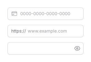
Input accessories can be seamlessly combined with other Fluxon components to create rich, interactive experiences. For example, you can use tooltips to provide helpful context or validation hints directly within the input field:
<.input name="email" placeholder="Enter email" class="pr-8">
  <:inner_suffix>
    <.tooltip>
      <.icon name="u-info-circle" class="size-4" />
      <:content>
        <p>Please enter a valid email address (e.g. user@example.com).</p>
      </:content>
    </.tooltip>
  </:inner_suffix>
</.input>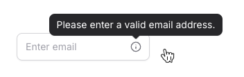
Manual Padding Adjustment
When using input accessories, you need to manually adjust the input's padding to accommodate the space taken by the accessory.
Use Tailwind's padding utilities on the input's class attribute:
- For prefix accessories: Add
pl-*classes (e.g.,class="pl-10") - For suffix accessories: Add
pr-*classes (e.g.,class="pr-10")
This manual adjustment ensures proper spacing and prevents text overlap with the accessories, as shown in the examples above.
Outer Accessories
Outer accessories are placed outside the input field, perfect for adding related actions or selections:
<.input field={f[:url]}>
  <:outer_prefix class="text-zinc-500 px-2 bg-zinc-100">https://</:outer_prefix>
</.input>

<.input field={f[:amount]} class="pl-6" placeholder="0.00">
  <:inner_prefix class="text-zinc-500">$</:inner_prefix>
  <:outer_prefix>
    <select class="h-full rounded-l-lg px-2 bg-zinc-100 dark:bg-zinc-800">
      <option>USD</option>
      <option>EUR</option>
    </select>
  </:outer_prefix>
</.input>

<.input field={f[:email]} placeholder="Enter email">
  <:outer_suffix>
    <.button>Send Invite</.button>
  </:outer_suffix>
</.input>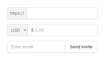
Error States
The component automatically handles error states when used with forms:
<.input
  name="email"
  value="invalid-email"
  errors={["must be a valid email address"]}
>
  <:inner_suffix>
    <.icon name="u-info-circle" class="size-4 text-red-400" />
  </:inner_suffix>
</.input>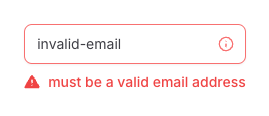
Summary
Components
Renders an input element with support for accessories, labels, and form integration.
Components
Renders an input element with support for accessories, labels, and form integration.
This component provides a flexible way to build form inputs with support for prefixes, suffixes, labels, and rich styling options. It includes built-in form integration, error handling, and accessibility features.
Attributes
id(:any) - The unique identifier for the input element. When not provided, a random ID will be generated. Defaults tonil.label(:string) - The primary label for the input element. This text is displayed above the input and is used for accessibility purposes. Defaults tonil.sublabel(:string) - Additional context displayed on the side of the main label. Useful for providing extra information without cluttering the main label. Defaults tonil.help_text(:string) - Help text to display below the input element. Useful for providing additional guidance or context. Defaults tonil.description(:string) - Detailed description of the input field. This text appears below the label and can contain longer explanatory text. Defaults tonil.class(:any) - Additional CSS classes to apply to the input element. Useful for controlling layout, spacing, and visual styling. Defaults tonil.size(:string) - The size variant of the input element. Available options:"sm": Small size, suitable for compact layouts"base": Default size, suitable for most use cases"lg": Large size, suitable for emphasized inputs"xl": Extra large size, suitable for hero sections or prominent inputs
Defaults to
"base".disabled(:boolean) - When true, disables the input element. Disabled inputs cannot be interacted with and appear visually muted. Defaults tofalse.field(Phoenix.HTML.FormField) - The form field to bind to. When provided, the component automatically handles value tracking, errors, and form submission.value(:any) - The current value of the input element. When using forms, this is automatically handled by thefieldattribute.name(:any) - The form name for the input element. Required when not using thefieldattribute.errors(:list) - List of error messages to display below the input. These are automatically handled when using thefieldattribute with form validation. Defaults to[].type(:string) - The type of the input element. Defaults to"text".Global attributes are accepted. Additional HTML attributes to add to the input element. Supports standard HTML input attributes. Supports all globals plus:
["accept", "autocomplete", "capture", "cols", "form", "list", "max", "maxlength", "min", "minlength", "pattern", "placeholder", "readonly", "required", "rows", "size", "step"].
Slots
inner_prefix- Content to be placed inside the input field at its start. Useful for adding icons, text, or other visual indicators. Accepts attributes:class(:any) - Additional CSS classes for styling the inner prefix container.
outer_prefix- Content to be placed outside the input field at its start. Useful for adding buttons, dropdowns, or other interactive elements. Accepts attributes:class(:any) - Additional CSS classes for styling the outer prefix container.
inner_suffix- Content to be placed inside the input field at its end. Useful for adding validation indicators, clear buttons, or other interactive elements. Accepts attributes:class(:any) - Additional CSS classes for styling the inner suffix container.
outer_suffix- Content to be placed outside the input field at its end. Useful for adding action buttons or additional controls. Accepts attributes:class(:any) - Additional CSS classes for styling the outer suffix container.