Fluxon.Components.Navlist (Fluxon v1.0.20)
A comprehensive navigation system for building structured, accessible navigation menus.
This component provides a flexible solution for creating navigation interfaces across your application. It offers a hierarchical structure with support for sections, headings, and interactive links, making it suitable for sidebars, settings pages, and other navigation-heavy interfaces.
The navigation system consists of three main components working together:
navlist: The main container that provides structure and spacingnavheading: Optional section headers for organizing navigation groupsnavlink: Interactive navigation items with LiveView integration
The navigation system follows a structured hierarchical organization:
navlist
├── navheading (optional)
├── navlink
├── navlink
└── navlink
This structure ensures proper spacing, accessibility, and visual organization while maintaining flexibility for various navigation patterns, including nested and expandable navigation.
Usage
The navlist component provides a structured way to build navigation menus:
<.navlist heading="Main Navigation">
  <.navlink navigate={~p"/dashboard"} active>
    <.icon name="hero-home" class="size-5" /> Dashboard
  </.navlink>
  <.navlink navigate={~p"/projects"}>
    <.icon name="hero-folder" class="size-5" /> Projects
  </.navlink>
  <.navlink navigate={~p"/settings"}>
    <.icon name="hero-cog-6-tooth" class="size-5" /> Settings
  </.navlink>
</.navlist>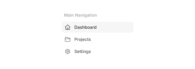
Multiple Sections
Create structured navigation with multiple sections:
<.navlist heading="Main">
  <.navlink navigate={~p"/dashboard"} active>
    <.icon name="hero-home" class="size-5" /> Dashboard
  </.navlink>
  <.navlink navigate={~p"/projects"}>
    <.icon name="hero-folder" class="size-5" /> Projects
  </.navlink>
</.navlist>

<.navlist heading="Settings">
  <.navlink navigate={~p"/profile"}>
    <.icon name="hero-user" class="size-5" /> Profile
  </.navlink>
  <.navlink navigate={~p"/preferences"}>
    <.icon name="hero-cog-6-tooth" class="size-5" /> Preferences
  </.navlink>
</.navlist>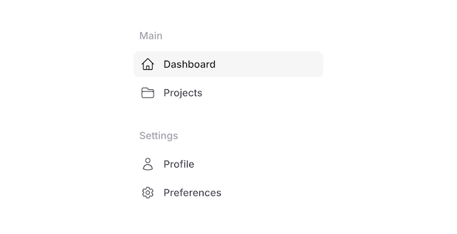
Badges and Counters
Enhance navigation items with badges and counters:
<.navlist heading="Inbox">
  <.navlink href="/inbox/unread">
    Unread
    <.badge variant="pill" color="red" class="ml-auto">23</.badge>
  </.navlink>

  <.navlink href="/inbox/starred">
    Starred
    <.badge variant="pill" class="ml-auto">5</.badge>
  </.navlink>
</.navlist>
Expandable Navigation
Create hierarchical navigation with expandable sections using LiveView's JS commands:
<.navlist heading="Sales">
  <.navlink phx-click={JS.toggle_attribute({"data-expanded", ""})}>
    <.icon name="hero-users" class="size-5" /> Customers
    <.icon
      name="hero-chevron-right"
      class="size-3 ml-auto text-zinc-500 [[data-expanded]_&]:rotate-90 transition-transform duration-200"
    />
  </.navlink>
  <div class="grid grid-rows-[0fr] [[data-expanded]~&]:grid-rows-[1fr] transition-all duration-200">
    <div class="overflow-hidden px-4 -mr-4 border-l ml-3">
      <.navlist>
        <.navlink phx-click={JS.toggle_attribute({"data-expanded", ""})}>
          Orders
          <.icon
            name="hero-chevron-right"
            class="size-3 ml-auto text-zinc-500 [[data-expanded]_&]:rotate-90 transition-transform duration-200"
          />
        </.navlink>
        <div class="grid grid-rows-[0fr] [[data-expanded]+&]:grid-rows-[1fr] transition-all duration-200">
          <div class="overflow-hidden px-4 border-l ml-3">
            <.navlist>
              <.navlink navigate="/invoices">Invoices</.navlink>
              <.navlink navigate="/orders">Orders</.navlink>
            </.navlist>
          </div>
        </div>

        <.navlink navigate="/customer-groups">Customer Groups</.navlink>

        <.navlink phx-click={JS.toggle_attribute({"data-expanded", ""})}>
          Segments
          <.icon
            name="hero-chevron-right"
            class="size-3 ml-auto text-zinc-500 [[data-expanded]_&]:rotate-90 transition-transform duration-200"
          />
        </.navlink>
        <div class="grid grid-rows-[0fr] [[data-expanded]+&]:grid-rows-[1fr] transition-all duration-200">
          <div class="overflow-hidden px-4 border-l ml-3">
            <.navlist>
              <.navlink navigate="/segments/active">Active</.navlink>
              <.navlink navigate="/segments/at-risk">At Risk</.navlink>
            </.navlist>
          </div>
        </div>
      </.navlist>
    </div>
  </div>
  <.navlink navigate="/subscriptions">
    <.icon name="hero-arrow-path" class="size-5" /> Subscriptions
  </.navlink>
</.navlist>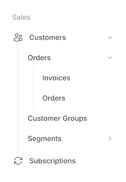
The expandable navigation pattern uses several key techniques:
JS.toggle_attribute/1for client-side toggling of expanded state- Grid-based height animation for smooth transitions
- Nested navlists for hierarchical structure
- Visual indicators with rotating chevron icons
- Left border and padding for visual hierarchy
Rich Navigation Examples
Create visually rich navigation interfaces with custom styling:
<.navlist>
  <.navheading class="text-xs uppercase font-medium text-zinc-400 dark:text-zinc-500">
    Customers
  </.navheading>

  <.navlink
    :for={
      {icon, label, badge, path, active} <- [
        {"hero-users", "Customers", nil, ~p"/customers", false},
        {"hero-shopping-bag", "Subscriptions", "23", ~p"/subscriptions", true},
        {"hero-cube", "Products", nil, ~p"/products", false},
        {"hero-tag", "Coupons", nil, ~p"/coupons", false}
      ]
    }
    navigate={path}
    active={active}
    class={[
      "group py-2 relative",
      "hover:text-blue-600 hover:bg-white hover:shadow",
      "dark:hover:bg-zinc-800",
      "hover:ring-1 ring-zinc-200",
      "dark:ring-zinc-800",
      "hover:after:absolute hover:after:inset-y-0 hover:after:left-0",
      "hover:after:my-1.5 hover:after:w-1 hover:after:bg-blue-600",
      "hover:after:rounded-r-md"
    ]}
  >
    <.icon class="size-5 text-zinc-500 dark:text-zinc-400 group-hover:text-blue-600" name={icon} />
    <span class="grow">{label}</span>
    <.badge :if={badge} color="blue">{badge}</.badge>
  </.navlink>
</.navlist>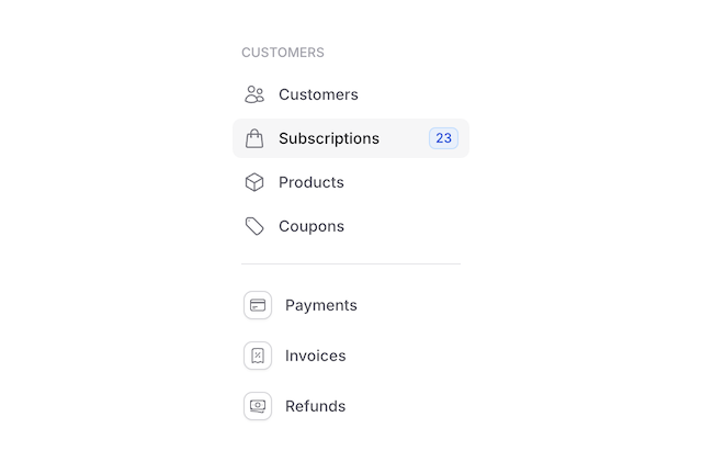
Summary
Components
Renders a navigation section heading with proper styling and spacing.
Renders an interactive navigation link with support for active states and LiveView integration.
Renders a navigation list container with optional heading and structured content.
Components
Renders an interactive navigation link with support for active states and LiveView integration.
This component provides a flexible way to create navigation items with consistent styling, proper spacing, and full LiveView integration. It supports icons, badges, and custom content while maintaining accessibility and interactive states.
Attributes
class(:any) - Additional CSS classes for the link element. These are merged with the component's base styles for hover and active states.Defaults to
nil.active(:boolean) - When true, applies active styling to the link including background color and enhanced text contrast.Defaults to
false.Global attributes are accepted. Additional HTML attributes supported by LiveView links including navigation attributes (patch, navigate) and standard link attributes. Supports all globals plus:
["target", "download", "rel", "hreflang", "type", "referrerpolicy", "navigate", "patch", "href", "replace", "method", "csrf_token", "autofocus", "disabled", "form", "formaction", "formenctype", "formmethod", "formnovalidate", "formtarget", "name", "type", "value"].
Slots
inner_block(required)
Basic Usage
<.navlink navigate={~p"/dashboard"} active>Dashboard</.navlink>With Icons
<.navlink navigate={~p"/inbox"}>
  <.icon name="hero-envelope" class="size-5" /> Inbox
  <.badge class="ml-auto">99+</.badge>
</.navlink>

<.navlink navigate={~p"/archive"}>
  <.icon name="hero-archive-box" class="size-5" /> Archive
</.navlink>

<.navlink navigate={~p"/trash"} class="text-red-600 dark:text-red-400">
  <.icon name="hero-trash" class="size-5" /> Trash
</.navlink>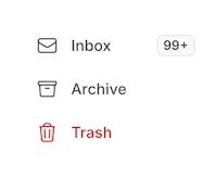
LiveView Navigation
The component supports all LiveView link attributes:
<.navlink patch={~p"/messages"} replace={true}>
  Messages
</.navlink>

<.navlink navigate={~p"/settings"}>
  Settings
</.navlink>
Active State
Navigation items can be marked as active using the active attribute:
<.navlink active={@current_path == "/dashboard"}>
  Dashboard
</.navlink>