Fluxon.Components.Popover (Fluxon v1.0.20)
A powerful and accessible popover component that displays floating content anchored to a trigger element.
This component provides a flexible solution for building tooltips, contextual menus, and interactive content that needs to be anchored to specific elements on the page. It offers a fully accessible implementation with keyboard navigation, automatic positioning, and proper focus management.
Usage
Create a simple informational tooltip:
<.popover open_on_hover>
  <.icon name="hero-information-circle" class="text-zinc-400" />

  <:content>
    <p class="text-sm">The invoice will be generated at the end of the month.</p>
  </:content>
</.popover>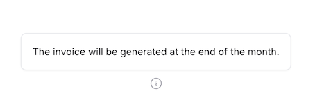
Interactive Content
Build rich interactive menus with forms and actions:
<.popover placement="bottom-end" class="w-64">
  <.button variant="ghost">
    <.icon name="hero-cog-6-tooth" /> Settings
  </.button>

  <:content>
    <div class="space-y-4">
      <div class="flex items-center justify-between">
        <span class="text-sm font-medium">Dark Mode</span>
        <.switch name="dark_mode" checked />
      </div>

      <div class="flex items-center justify-between">
        <span class="text-sm font-medium">Notifications</span>
        <.switch name="notifications" />
      </div>

      <.button size="sm" class="w-full">
        <.icon name="hero-arrow-path" class="icon" /> Reset Preferences
      </.button>
    </div>
  </:content>
</.popover>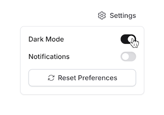
Search Suggestions
Create dynamic search suggestions with focus interaction:
<.popover open_on_focus placement="bottom-start" class="w-80">
  <.input type="search" placeholder="Search users..." phx-debounce="300" />

  <:content>
    <div :if={@loading} class="p-4 flex justify-center">
      <.loading />
    </div>

    <div :for={user <- @users} class="p-2 hover:bg-zinc-50 cursor-pointer">
      <div class="font-medium">{user.name}</div>
      <div class="text-sm text-zinc-600">{user.email}</div>
    </div>
  </:content>
</.popover>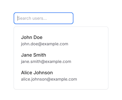
Form Field Help
Provide contextual help for form fields:
<.input name="api-key" label="API Key" value="sk_test_..." class="font-mono">
  <:inner_suffix>
    <.popover open_on_hover placement="right">
      <.icon name="hero-question-mark-circle" class="text-zinc-400" />

      <:content>
        <div class="max-w-xs space-y-2">
          <p class="text-sm font-medium">About API Keys</p>
          <p class="text-sm text-zinc-600">
            Your API key is used to authenticate requests. Keep it secure and
            never share it publicly.
          </p>
          <.link class="text-sm text-blue-600 hover:underline" href="/docs/api-keys">
            Learn more about API keys →
          </.link>
        </div>
      </:content>
    </.popover>
  </:inner_suffix>
</.input>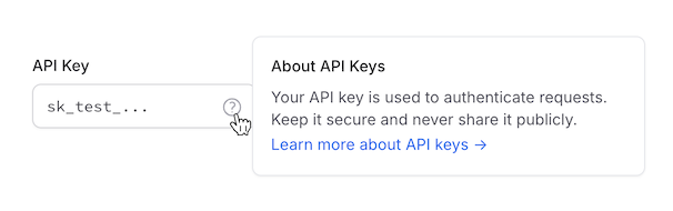
Filters
Create filter panels:
<.popover placement="bottom-end" class="w-64">
  <.button variant="ghost">
    <.icon name="hero-adjustments-horizontal" class="icon" /> Table settings
  </.button>
  <:content>
    <h3 class="dark:text-zinc-300 font-medium">Table settings</h3>
    <div class="flex items-center gap-2 text-sm mt-3">
      <.icon name="hero-arrows-up-down" class="text-zinc-700 dark:text-zinc-300 size-4" /> Sort by
      <div class="ml-auto flex items-center gap-2">
        <.select
          native
          value="Name"
          options={["Name", "Date", "Size", "Type", "Modified"]}
          name="sort_by"
          size="sm"
          class="py-1 shadow-none"
        />
      </div>
    </div>
    <div class="flex items-center gap-2 text-sm mt-2">
      <.icon name="hero-view-columns" class="text-zinc-700 dark:text-zinc-300 size-4" /> View
      <div class="ml-auto flex items-center gap-2">
        <.select
          native
          value="List"
          options={["List", "Board", "Calendar", "Timeline"]}
          name="view"
          size="sm"
          class="py-1 shadow-none"
        />
      </div>
    </div>

    <.separator class="my-4" />

    <h3 class="dark:text-zinc-300 font-medium">Columns</h3>

    <div class="flex items-center justify-between mt-3">
      <.label for="name" class="text-zinc-700 dark:text-zinc-300">Name</.label>
      <.switch name="name" checked id="name" />
    </div>

    <div class="flex items-center justify-between mt-3">
      <.label for="date" class="text-zinc-700 dark:text-zinc-300">Date</.label>
      <.switch name="date" checked id="date" />
    </div>

    <div class="flex items-center justify-between mt-3">
      <.label for="size" class="text-zinc-700 dark:text-zinc-300">Size</.label>
      <.switch name="size" checked id="size" />
    </div>

    <div class="flex items-center justify-between mt-3">
      <.label for="type" class="text-zinc-700 dark:text-zinc-300">Type</.label>
      <.switch name="type" id="type" />
    </div>

    <div class="flex items-center justify-between mt-3">
      <.label for="modified" class="text-zinc-700 dark:text-zinc-300">Modified</.label>
      <.switch name="modified" id="modified" />
    </div>
  </:content>
</.popover>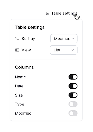
Summary
Components
Renders a popover component with rich interaction support and automatic positioning.
Components
Renders a popover component with rich interaction support and automatic positioning.
This component provides a flexible way to create tooltips, contextual menus, and other floating content that needs to be anchored to specific elements. It supports multiple interaction modes and intelligent positioning while maintaining accessibility.
Attributes
id(:string) - Optional unique identifier for the popover. If not provided, a random ID will be generated. Useful when you need to programmatically control the popover.class(:any) - Additional CSS classes to be applied to the popover content container. Useful for controlling width, padding, and other visual styles.Defaults to
nil.open_on_hover(:boolean) - When true, the popover will open when hovering over the trigger element. Perfect for tooltip-like behavior and quick information display.Defaults to
false.open_on_focus(:boolean) - When true, the popover will open when the trigger element receives focus. Ideal for form helpers, search suggestions, and accessibility improvements.Defaults to
false.placement(:string) - Controls the preferred placement of the popover relative to its trigger element. The actual placement may adjust automatically if there isn't enough space.Available options:
top,top-start,top-end: Above the triggerbottom,bottom-start,bottom-end: Below the triggerleft,left-start,left-end: To the left of the triggerright,right-start,right-end: To the right of the trigger
The
-startand-endvariants control alignment along the cross axis.Defaults to
"top".
Slots
inner_block(required) - The trigger element that will open the popover. This can be any HTML element or component, such as a button, input, or custom element.content(required) - The content to display in the popover. Can contain any HTML or components, from simple text to complex interactive elements like forms or menus.