Fluxon.Components.Radio (Fluxon v1.0.20)
A versatile radio component for building single-selection interfaces with rich styling options.
This component provides a comprehensive solution for creating accessible radio button groups with support for both standard and card-based layouts. It seamlessly integrates with Phoenix forms and offers extensive customization options for building everything from simple option lists to visually rich selection interfaces.
Usage
The radio group component can be used in its simplest form for single selections:
<.radio_group name="system" value="debian" label="Operating System">
  <:radio value="ubuntu" label="Ubuntu" />
  <:radio value="debian" label="Debian" />
  <:radio value="fedora" label="Fedora" />
</.radio_group>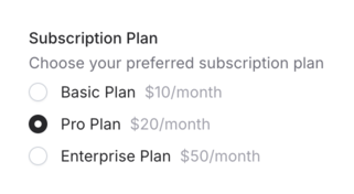
For more context, you can add sublabels and descriptions:
<.radio_group
  name="system"
  label="Operating System"
  sublabel="Choose your preferred OS"
  description="Select the operating system that best suits your needs"
>
  <:radio
    value="ubuntu"
    label="Ubuntu"
    sublabel="Popular and user-friendly"
    description="Ubuntu is a Debian-based Linux operating system"
  />
  <:radio
    value="debian"
    label="Debian"
    sublabel="Stable and reliable"
    description="Debian is a Linux distribution composed of free and open-source software"
  />
  <:radio
    value="fedora"
    label="Fedora"
    sublabel="Cutting-edge features"
    description="Fedora is a Linux distribution developed by the Fedora Project"
  />
</.radio_group>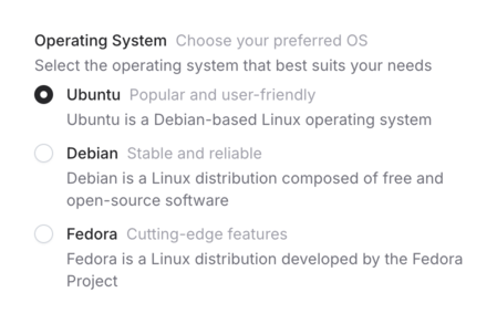
Form Integration
The radio group component offers two ways to handle form data: using the field attribute for Phoenix form integration
or using the name attribute for standalone radio groups. Each approach has its own benefits and use cases.
Using with Phoenix Forms (Recommended)
When working with Phoenix forms, use the field attribute to bind the radio group to a form field:
<.form :let={f} for={@form} phx-change="validate" phx-submit="save">
  <.radio_group
    field={f[:subscription]}
    label="Subscription Plan"
    description="Choose your preferred subscription plan"
  >
    <:radio value="basic" label="Basic Plan" sublabel="$10/month" />
    <:radio value="pro" label="Pro Plan" sublabel="$20/month" />
    <:radio value="enterprise" label="Enterprise Plan" sublabel="$50/month" />
  </.radio_group>
</.form>
Using the field attribute provides several advantages:
- Automatic value handling from the form data
- Built-in error handling and validation messages
- Proper form submission with correct field names
- Integration with changesets for data validation
- Automatic ID generation for accessibility
- Proper handling of nested form data
The component will automatically:
- Set the radio field's name based on the form structure
- Display the current value from the form data
- Show validation errors when present
- Handle nested form data with proper input naming
Using Standalone Radio Groups
For simpler cases or when not using Phoenix forms, use the name attribute:
<.radio_group
  name="theme"
  value={@current_theme}
  errors={@errors}
  label="Theme Selection"
>
  <:radio value="light" label="Light Theme" />
  <:radio value="dark" label="Dark Theme" />
  <:radio value="system" label="System Theme" />
</.radio_group>
When using standalone radio groups:
- You must provide the
nameattribute - Values must be managed manually via the
valueattribute - Errors must be passed explicitly via the
errorsattribute - Form submission handling needs to be implemented manually
- Nested data requires manual name formatting (e.g.,
user[preferences][theme])
When to Use Each Approach
Use the field attribute when:
- Working with changesets and data validation
- Handling complex form data structures
- Need automatic error handling
- Building CRUD interfaces
Use the name attribute when:
- Building simple selection interfaces
- Creating standalone filters
- Handling one-off form controls
- Need more direct control over the radio group behavior
Card Variant
The component offers a card variant that transforms radio buttons into rich, interactive selection cards:
<.radio_group
  name="system"
  label="Choose a plan"
  description="Choose the plan that best suits your needs."
  variant="card"
  control="left"
  class="gap-0"
>
  <:radio value="basic" label="Basic" sublabel="Perfect for small projects" class="rounded-none -my-px rounded-t-lg" />
  <:radio value="pro" label="Professional" checked sublabel="Most popular for growing teams" class="rounded-none -my-px" />
  <:radio value="business" label="Business" sublabel="Advanced features for larger teams" class="rounded-none -my-px" />
  <:radio value="enterprise" label="Enterprise" sublabel="Custom solutions for organizations" class="rounded-none -my-px" />
</.radio_group>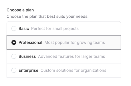
Rich Content
The card variant supports custom content through the radio slot, enabling highly customized selection interfaces:
<.radio_group name="system" label="Category" variant="card" class="grid grid-cols-3">
  <:radio value="web-design" class="flex-1 group has-[:checked]:border-blue-500 has-[:checked]:bg-blue-50">
    <div class="flex flex-col justify-center items-center w-full gap-2">
      <.icon name="u-layout-alt-01-duotone" class="size-6 text-zinc-500 group-has-[:checked]:text-blue-500" />
      <span class="font-medium text-sm group-has-[:checked]:text-zinc-800">Web Design</span>
    </div>
  </:radio>
  <:radio value="ui-ux" class="flex-1 group has-[:checked]:border-blue-500 has-[:checked]:bg-blue-50">
    <div class="flex flex-col justify-center items-center w-full gap-2">
      <.icon name="u-pen-tool-01-duotone" class="size-6 text-zinc-500 group-has-[:checked]:text-blue-500" />
      <span class="font-medium text-sm group-has-[:checked]:text-zinc-800">UI/UX Design</span>
    </div>
  </:radio>
  <:radio value="development" class="flex-1 group has-[:checked]:border-blue-500 has-[:checked]:bg-blue-50">
    <div class="flex flex-col justify-center items-center w-full gap-2">
      <.icon name="u-laptop-02-duotone" class="size-6 text-zinc-500 group-has-[:checked]:text-blue-500" />
      <span class="font-medium text-sm group-has-[:checked]:text-zinc-800">Development</span>
    </div>
  </:radio>
</.radio_group>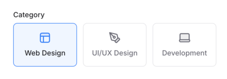
Summary
Components
Renders a radio group for managing single-selection options.
Components
Renders a radio group for managing single-selection options.
This component provides a flexible way to handle exclusive selections, with support for both standard radio lists and rich card-based interfaces. It includes built-in form integration, error handling, and accessibility features.
Attributes
id(:any) - The unique identifier for the radio group. When not provided, a random ID will be generated. Defaults tonil.name(:string) - The form name for the radio group. Required when not using thefieldattribute.value(:any) - The current selected value of the radio group. When using forms, this is automatically handled by thefieldattribute.label(:string) - The primary label for the radio group. This text is displayed above the radio buttons and is used for accessibility purposes.Defaults to
nil.sublabel(:string) - Additional context displayed on the side of the main label. Useful for providing extra information about the radio group without cluttering the main label.Defaults to
nil.description(:string) - Detailed description of the radio group. This text appears below the label and can contain longer explanatory text about the available options.Defaults to
nil.errors(:list) - List of error messages to display below the radio group. These are automatically handled when using thefieldattribute with form validation.Defaults to
[].class(:any) - Additional CSS classes to apply to the radio group container. Useful for controlling layout, spacing, and visual styling of the group.Defaults to
nil.field(Phoenix.HTML.FormField) - The form field to bind to. When provided, the component automatically handles value tracking, errors, and form submission.disabled(:boolean) - When true, disables all radio buttons in the group. Disabled radio buttons cannot be interacted with and appear visually muted.Defaults to
false.variant(:string) - The visual variant of the radio group. Currently supports:nil(default): Standard stacked radio buttons"card": Rich selection cards with support for custom content
Defaults to
nil.control(:string) - Controls the position of the radio input in card variants. It's only available whenvariant="card"."left": Places the radio button on the left side of the card"right": Places the radio button on the right side of the card Must be one of"left", or"right".
Slots
radio(required) - Defines the individual radio buttons within the group. Each radio button can have:value: The value associated with this radio buttonlabel: The radio button labelsublabel: Additional context on the side of the labeldescription: Detailed description of the optiondisabled: Whether this specific radio button is disabledclass: Additional CSS classes for this radio buttonchecked: Whether this radio button should be checked by default
value(:any) (required)label(:string)sublabel(:string)description(:string)disabled(:boolean)class(:any)checked(:boolean)