Fluxon.Components.Separator (Fluxon v1.0.20)
A versatile separator component for creating visual boundaries between content sections.
This component provides a flexible solution for visually dividing content across your application. It supports both horizontal and vertical orientations, with optional text labels, making it suitable for various layout patterns and content organization needs.
Usage
The separator provides a subtle visual division between content sections:
<div class="py-2">Content above</div>
<.separator />
<div class="py-2">Content below</div>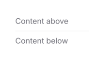
Orientation Options
The component supports both horizontal and vertical orientations:
# Default horizontal separator
<.separator />

# Vertical separator for inline content
<div class="flex h-8 items-center gap-4">
  <span>Left</span>
  <.separator vertical />
  <span>Right</span>
</div>
Text Separators
Add text labels to create semantic divisions:
<.separator text="or" />Customization
The separator can be customized using Tailwind classes while maintaining its core styling:
# Custom spacing
<.separator class="my-8" />

# Full-height vertical separator
<.separator vertical class="mx-4 h-full" />

# Text separator with custom spacing
<.separator text="Section" class="my-6" />
Common Use Cases
Form Sections
Use separators to organize form sections clearly:
<div class="space-y-4">
  <div>Profile Information</div>
  <.separator />
  <div>Account Settings</div>
  <.separator />
  <div>Privacy Options</div>
</div>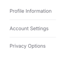
Content Groups
Create clear content divisions with labeled separators:
<div class="space-y-4">
  <.separator text="Recent" />
  <div>Recent items...</div>

  <.separator text="Previous" />
  <div>Previous items...</div>
</div>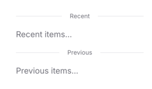
Inline Elements
Use vertical separators to divide inline elements:
<div class="flex items-center gap-4">
  <span>Profile</span>
  <.separator vertical />
  <span>Settings</span>
  <.separator vertical />
  <span>Logout</span>
</div>
Summary
Components
Renders a separator with support for horizontal, vertical, and text variants.
Components
Renders a separator with support for horizontal, vertical, and text variants.
This component provides a flexible way to create visual divisions between content sections. It supports both horizontal and vertical orientations, with optional text labels, while maintaining consistent styling and accessibility.
Attributes
text(:string) - Optional text to display in the center of the separator. When provided, creates a separator with centered text and lines on either side.Defaults to
nil.vertical(:boolean) - When true, renders a vertical separator instead of the default horizontal orientation. Cannot be used together with the text attribute.Defaults to
false.class(:any) - Additional CSS classes to apply to the separator. The component maintains its core visual styling while allowing customization of spacing and dimensions.Defaults to
nil.