Fluxon.Components.Switch (Fluxon v1.0.20)
A versatile toggle switch component for binary choices and settings.
This component provides an accessible and customizable switch control that serves as an alternative to checkboxes, particularly suited for immediate actions and settings. While checkboxes are better for form submissions and multiple selections, switches excel at toggling states with immediate effect.
Usage
The switch component can be used standalone or within forms:
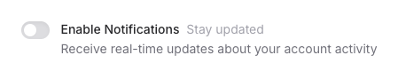
<.switch
  name="notifications"
  label="Enable Notifications"
  sublabel="Stay updated"
  description="Receive real-time updates about your account activity"
/>
Form Integration
The component seamlessly integrates with Phoenix forms:
<.form :let={f} for={@form} phx-change="update_settings">
  <.switch
    field={f[:notifications_enabled]}
    label="Push Notifications"
    sublabel="Real-time updates"
  />
</.form>
Customization
The switch component offers various customization options through colors and sizes:
<!-- Different sizes -->
<.switch label="Small Switch" size="sm" />
<.switch label="Default Size" />
<.switch label="Large Switch" size="lg" />

<!-- Different colors -->
<.switch label="Success" color="green" />
<.switch label="Warning" color="amber" />
<.switch label="Danger" color="red" />
Switch vs Checkbox
While both switches and checkboxes handle boolean states, they serve different UX purposes:
- Switches are best for immediate actions (e.g., toggling a setting that takes effect immediately)
- Checkboxes are better for form submissions and multiple-choice selections
- Switches suggest a direct state change, while checkboxes are more about selection/deselection
- Use switches for binary settings (on/off, enabled/disabled) and checkboxes for agreement or multiple options
Summary
Components
Renders a switch component for toggling between two states.
Components
Renders a switch component for toggling between two states.
This component provides an accessible toggle switch that can be used standalone or within forms. It supports various sizes, colors, and states, making it suitable for different UI contexts.
Attributes
id(:any) - The unique identifier for the switch. When not provided, a random ID will be generated.name(:string) - The form name for the switch. Required when not using thefieldattribute.class(:any) - Additional CSS classes to apply to the switch wrapper. Useful for controlling layout and spacing.Defaults to
nil.checked(:boolean) - Whether the switch is in the on position. When using forms, this is automatically handled by thefieldattribute.disabled(:boolean) - When true, disables the switch. Disabled switches cannot be interacted with and appear visually muted.Defaults to
false.value(:any) - The value associated with the switch. This value is submitted when the switch is in the on position.label(:string) - The primary label for the switch. This text is displayed next to the switch and is used for accessibility purposes.Defaults to
nil.sublabel(:string) - Additional context displayed to the side of the main label. Useful for providing extra information without cluttering the main label.Defaults to
nil.description(:string) - Detailed description of the switch option. This text appears below the label and can contain longer explanatory text.Defaults to
nil.size(:string) - Controls the size of the switch:"sm": Small switch, suitable for compact UIs"base": Default size, works well in most contexts"lg": Large switch, good for touch interfaces or emphasis
Defaults to
"base".color(:string) - The color theme of the switch when in the on position. Supports all Tailwind CSS colors. The color affects the background of the switch track when checked.Defaults to
"gray".field(Phoenix.HTML.FormField) - The form field to bind to. When provided, the component automatically handles value tracking and form submission.