Fluxon.Components.Table (Fluxon v1.0.20)
A comprehensive table system for displaying structured data with rich customization options.
This component provides a flexible solution for building data tables across your application. It offers a structured set of components working together to create accessible, responsive tables with support for custom styling, complex content, and interactive features.
The table system consists of four main components working together:
table: The main container providing structure and responsive behaviortable_head: Header section with column definitionstable_body: Content section containing rows of datatable_row: Individual data rows with cell content
The table system follows a structured hierarchical organization:
table
├── table_head
│   └── columns (col slots)
└── table_body
    └── table_rows
        └── cells (cell slots)
Usage
Create a simple data table with headers and rows:
<.table>
  <.table_head>
    <:col>Name</:col>
    <:col>Status</:col>
    <:col>Email</:col>
  </.table_head>

  <.table_body>
    <.table_row>
      <:cell>Alice Smith</:cell>
      <:cell>New</:cell>
      <:cell>alice@example.com</:cell>
    </.table_row>
    <.table_row>
      <:cell>Bob Johnson</:cell>
      <:cell>In Progress</:cell>
      <:cell>bob@example.com</:cell>
    </.table_row>
  </.table_body>
</.table>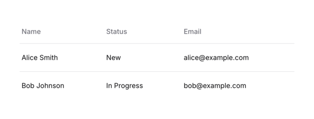
Rich Content
Tables support complex cell content with custom styling:
<.table>
  <.table_head>
    <:col>Lead</:col>
    <:col>Stage</:col>
    <:col>Contact</:col>
    <:col></:col>
  </.table_head>
  <.table_body>
    <.table_row>
      <:cell class="w-full flex items-center gap-2">
        <img src="https://i.pravatar.cc/150?u=1" class="size-9 rounded-full" />
        <div class="flex flex-col gap-0.5">
          <span class="font-semibold">Sarah Johnson</span>
          <span class="text-zinc-400 text-sm/3">Product Manager</span>
        </div>
      </:cell>
      <:cell>
        <.badge color="green">Active</.badge>
      </:cell>
      <:cell>sarah.j@example.com</:cell>
      <:cell>
        <.icon name="hero-ellipsis-horizontal" class="size-5" />
      </:cell>
    </.table_row>
  </.table_body>
</.table>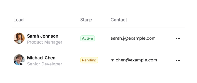
Interactive Features
Row Selection
Add checkboxes for row selection:
<.table>
  <.table_head>
    <:col><.checkbox name="select-all" /></:col>
    <:col>Lead</:col>
    <:col>Stage</:col>
    <:col>Contact</:col>
  </.table_head>
  <.table_body>
    <.table_row>
      <:cell><.checkbox name="selected_leads[]" /></:cell>
      <:cell>John Smith</:cell>
      <:cell>New Lead</:cell>
      <:cell>john.smith@example.com</:cell>
    </.table_row>
  </.table_body>
</.table>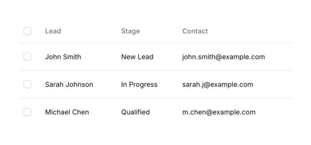
Sortable Columns
Implement sortable columns with LiveView integration:
<.table>
  <.table_head>
    <:col phx-click="sort" phx-value-column="name">
      <div class="flex items-center gap-1">
        Lead <.icon name="hero-chevron-up-down" class="size-4 text-zinc-500 dark:text-zinc-600" />
      </div>
    </:col>
    <:col phx-click="sort" phx-value-column="stage">
      <div class="flex items-center gap-1">
        Stage <.icon name="hero-chevron-up-down" class="size-4 text-zinc-500 dark:text-zinc-600" />
      </div>
    </:col>
  </.table_head>
  <.table_body>
    <.table_row>
      <:cell>John Smith</:cell>
      <:cell>New Lead</:cell>
    </.table_row>
  </.table_body>
</.table>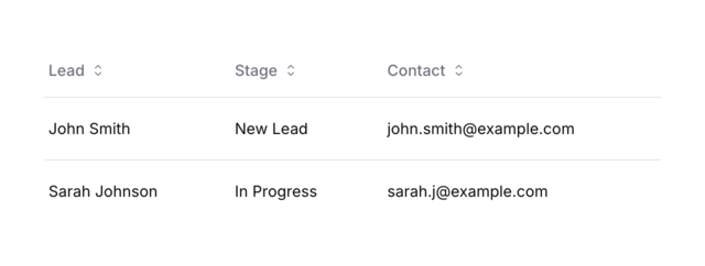
Clickable Rows
Tables often need interactive rows that navigate to detail pages or trigger actions. Here are two common patterns:
LiveView Events
Use phx-click to handle row clicks with LiveView events:
<.table>
  <.table_head>
    <:col>Customer</:col>
    <:col>Status</:col>
    <:col>Last Order</:col>
  </.table_head>

  <.table_body>
    <.table_row
      :for={customer <- @customers}
      class="cursor-pointer hover:bg-zinc-50 dark:hover:bg-zinc-800/50"
      phx-click="show_customer"
      phx-value-id={customer.id}
    >
      <:cell>
        <div class="flex items-center gap-2">
          <img src={customer.avatar} class="size-8 rounded-full" />
          <span class="font-medium">{customer.name}</span>
        </div>
      </:cell>
      <:cell><.badge color="green">Active</.badge></:cell>
      <:cell>{customer.last_order_date}</:cell>
    </.table_row>
  </.table_body>
</.table>
Direct Navigation
Use JS.navigate for immediate client-side navigation:
<.table>
  <.table_head>
    <:col>Project</:col>
    <:col>Status</:col>
    <:col>Team</:col>
  </.table_head>

  <.table_body>
    <.table_row
      :for={project <- @projects}
      class={[
        "group cursor-pointer",
        "hover:bg-zinc-50 dark:hover:bg-zinc-800/50",
        "focus:outline-none focus-visible:bg-zinc-50 dark:focus-visible:bg-zinc-800/50"
      ]}
      tabindex="0"
      phx-click={JS.navigate(~p"/projects/#{project.id}")}
    >
      <:cell>
        <div class="flex items-center justify-between">
          <span class="font-medium">{project.name}</span>
          <.icon
            name="hero-arrow-right"
            class="size-4 text-zinc-400 opacity-0 group-hover:opacity-100 transition-opacity"
          />
        </div>
      </:cell>
      <:cell>
        <.badge color={project.status_color}>{project.status}</.badge>
      </:cell>
      <:cell>
        <div class="flex -space-x-2">
          <img
            :for={member <- Enum.take(project.team_members, 3)}
            src={member.avatar}
            class="size-7 rounded-full ring-2 ring-white dark:ring-zinc-900"
          />
          <span
            :if={length(project.team_members) > 3}
            class="flex items-center justify-center size-7 rounded-full bg-zinc-100 ring-2 ring-white dark:ring-zinc-900 dark:bg-zinc-800"
          >
            <span class="text-xs font-medium">
              +{length(project.team_members) - 3}
            </span>
          </span>
        </div>
      </:cell>
    </.table_row>
  </.table_body>
</.table>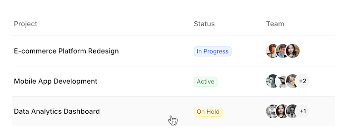
Summary
Components
Renders a responsive table container with support for complex data presentation.
Renders a table body section containing rows of data.
Renders a table header section with support for custom column styling and interactivity.
Renders a table row with support for custom cell content and styling.
Components
Renders a responsive table container with support for complex data presentation.
This component serves as the foundation for building data tables, providing proper
structure, responsive behavior, and accessibility features. It works in conjunction
with table_head, table_body, and table_row components to create comprehensive
table interfaces.
Attributes
class(:any) - Additional CSS classes for the table element. The table maintains its core styling including text size, color, and minimum width.Defaults to
nil.Global attributes are accepted. Additional HTML attributes to apply to the table element.
Slots
inner_block(required) - The content of the table. Usually contains table_head and table_body components.
Renders a table body section containing rows of data.
This component provides the container for table rows, maintaining proper table
semantics and styling. It's designed to work within the table component.
Attributes
class(:any) - Additional CSS classes for the tbody element. Defaults tonil.- Global attributes are accepted. Additional HTML attributes to apply to the tbody element.
Slots
inner_block(required) - The content of the table body. Usually contains table_row components.
Basic Usage
<.table_body>
  <.table_row>
    <:cell>John Smith</:cell>
    <:cell>john@example.com</:cell>
    <:cell>Active</:cell>
  </.table_row>
</.table_body>Renders a table header section with support for custom column styling and interactivity.
This component provides a way to define table columns with consistent styling and
support for interactive features like sorting. It's designed to work within the
table component.
Attributes
class(:any) - Additional CSS classes for the thead element. Default styling includes muted text color and bottom border.Defaults to
nil.Global attributes are accepted. Additional HTML attributes to apply to the thead element.
Slots
col(required) - Defines table columns. Each column is rendered as a th element with consistent padding and text alignment. The validate_attrs: false allows passing arbitrary attributes to the th elements.
Basic Usage
<.table_head>
  <:col>Name</:col>
  <:col>Email</:col>
  <:col>Status</:col>
</.table_head>
Interactive Headers
Add sorting functionality to columns:
<.table_head>
  <:col phx-click="sort" phx-value-column="name">
    <div class="flex items-center gap-1">
      Name <.icon name="hero-chevron-up-down" class="size-4" />
    </div>
  </:col>
</.table_head>Renders a table row with support for custom cell content and styling.
This component provides a flexible way to create table rows with rich content
and consistent styling. It's designed to work within the table_body component.
Attributes
class(:any) - Additional CSS classes for the tr element. These are merged with the component's base styles for borders or striping.Defaults to
nil.Global attributes are accepted. Additional HTML attributes to apply to the tr element.
Slots
cell(required) - Defines table cells. Each cell can include custom content and styling through the class attribute. The validate_attrs: false allows passing arbitrary attributes to the td elements.
Basic Usage
<.table_row>
  <:cell>John Smith</:cell>
  <:cell>john@example.com</:cell>
  <:cell>Active</:cell>
</.table_row>
Rich Cell Content
Add complex content to cells:
<.table_row>
  <:cell class="w-full flex items-center gap-2">
    <img src={@user.avatar} class="size-9 rounded-full" />
    <div class="flex flex-col">
      <span class="font-semibold">{@user.name}</span>
      <span class="text-zinc-400 text-sm">{@user.role}</span>
    </div>
  </:cell>
</.table_row>