Fluxon.Components.Tooltip (Fluxon v1.0.20)
A lightweight and accessible tooltip component for displaying informative content on hover or focus.
This component provides a flexible solution for adding contextual information to UI elements without cluttering the interface. It offers automatic positioning, focus management, and proper ARIA attributes for accessibility. The component is designed to be lightweight and performant, making it suitable for interfaces with many tooltip instances.
Usage
Create a simple text tooltip:
<.tooltip value="Opens in a new window">
  <.button>Open</.button>
</.tooltip>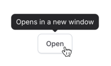
Rich Content
Use the content slot for complex tooltip content:
<.tooltip>
  <.button>View details</.button>

  <:content>
    <div class="space-y-2">
      <img src={~p"/images/preview.png"} class="rounded-lg w-full" />
      <p class="text-sm">Preview of the document layout and structure.</p>
    </div>
  </:content>
</.tooltip>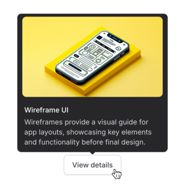
Placement Options
Control tooltip positioning with the placement attribute:
<div class="flex gap-4">
  <.tooltip value="Opens in a new window" placement="top">
    <.button>Top (default)</.button>
  </.tooltip>

  <.tooltip value="Saves to your profile" placement="right">
    <.button>Right</.button>
  </.tooltip>

  <.tooltip value="Requires permission" placement="bottom">
    <.button>Bottom</.button>
  </.tooltip>
</div>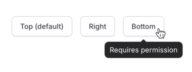
Common Use Cases
Icon-Only Buttons
Add tooltips to icon buttons for clarity:
<div class="flex gap-2">
  <.tooltip value="Share">
    <.button variant="ghost"><.icon name="hero-share" /></.button>
  </.tooltip>

  <.tooltip value="Add to favorites">
    <.button variant="ghost"><.icon name="hero-star" /></.button>
  </.tooltip>
</div>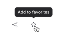
Form Field Help
Provide additional context for form fields:
<div class="flex items-center gap-2">
  <.input type="text" name="api_key" value="asd">
    <:inner_suffix>
      <.tooltip value="Your API key can be found in the developer settings">
        <.icon name="hero-question-mark-circle" class="text-zinc-400" />
      </.tooltip>
    </:inner_suffix>
  </.input>
</div>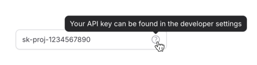
Content Preview
Show previews without requiring interaction:
<.tooltip class="max-w-xs">
  <.link navigate={~p"/users/#{user.id}"}>
    {user.name}
  </.link>

  <:content>
    <div class="space-y-1">
      <p class="font-medium">{user.name}</p>
      <p class="text-sm text-zinc-300">{user.title}</p>
      <p class="text-sm text-zinc-300">{user.department}</p>
    </div>
  </:content>
</.tooltip>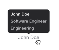
Customization
Customize appearance with CSS classes and control the arrow:
<.tooltip
  value="Draft saved"
  class="bg-green-600 text-white"
  arrow={false}
>
  <.badge>Draft</.badge>
</.tooltip>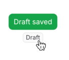
For smoother UX in dense interfaces, add a delay:
<.tooltip value="Archived items are hidden from the main view" delay={300}>
  <.icon name="hero-archive" class="text-zinc-400" />
</.tooltip>
Positioning System
The tooltip intelligently positions itself relative to its trigger element, automatically adjusting its placement based on available viewport space. This ensures optimal visibility regardless of the trigger's position on the page. The positioning system handles:
- Automatic repositioning when near viewport edges
- Smooth transitions between positions
- Proper arrow alignment with the trigger
- Consistent spacing and offset management
Summary
Components
Renders a tooltip component with automatic positioning and accessibility features.
Components
Renders a tooltip component with automatic positioning and accessibility features.
This component provides a flexible way to add contextual information to UI elements through tooltips. It supports both simple text tooltips and rich content, with automatic positioning and proper accessibility attributes.
Attributes
id(:string) - Optional unique identifier for the tooltip. If not provided, a random ID will be generated.value(:string) - The text content to display in the tooltip. For simple text-only tooltips, this is the preferred approach. For rich content, use thecontentslot instead.Defaults to
nil.class(:any) - Additional CSS classes to be applied to the tooltip container. These classes will be merged with the default styles. Useful for customizing the tooltip's appearance or dimensions.Defaults to
nil.arrow(:boolean) - Whether to show the arrow indicator pointing to the trigger element. Defaults to true. Set to false for a cleaner look or when using custom styling.Defaults to
true.placement(:string) - Controls where the tooltip appears relative to its trigger element. The tooltip will automatically adjust if there isn't enough space in the specified direction.Available options:
top: Above the trigger (default)bottom: Below the triggerleft: To the left of the triggerright: To the right of the trigger
Defaults to
"top".delay(:integer) - The delay in milliseconds before showing the tooltip. Useful for preventing unwanted tooltips when users briefly hover over elements. A value of 0 means no delay.Defaults to
0.
Slots
inner_block(required) - The trigger element that will show the tooltip on hover. This can be any HTML element or component, such as a button, icon, or text.content- Optional slot for rich tooltip content. When provided, this content will be used instead of thevalueattribute. Can contain any HTML or components.