Fluxon.Components.Button (Fluxon v1.0.21)
A versatile button component that provides consistent, accessible, and visually appealing interactive elements.
This component offers a comprehensive solution for building interactive elements across your application, from simple actions to complex workflows. It seamlessly integrates with Phoenix LiveView and provides built-in support for both button and anchor tag rendering, making it suitable for navigation, form submissions, and general user interactions.
Usage
Buttons can be used in their simplest form for actions and interactions:
<.button>Default Button</.button>
<.button variant="solid">Solid Button</.button>
<.button variant="ghost">Ghost Button</.button>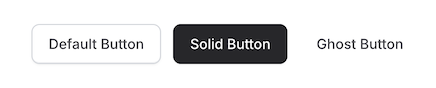
Visual Variants
The component supports three distinct visual styles:
<.button variant="default">Default</.button>
<.button variant="solid">Solid</.button>
<.button variant="ghost">Ghost</.button>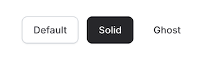
Each variant is designed for specific use cases:
default: Standard button with subtle gradient and border, ideal for secondary actionssolid: Filled button with stronger visual weight, perfect for primary actionsghost: Borderless button with hover state, great for tertiary actions
Colors and Theming
The button supports multiple color schemes, each carefully designed for both light and dark modes:
<.button color="blue" variant="solid">Primary</.button>
<.button color="green" variant="solid">Success</.button>
<.button color="red" variant="solid">Danger</.button>
<.button color="yellow" variant="solid">Warning</.button>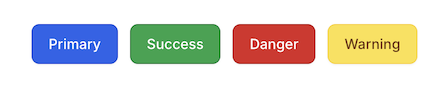
Available colors and their common use cases:
default: Neutral gray tones for general actionsred: Error and destructive actionsyellow: Warning or attention actionsgreen: Success or confirmation actionsblue: Primary or call-to-action buttons
Each color includes specific styling for all variants:
- Default: Semi-transparent with matching border
- Solid: Full color with white text
- Ghost: Colored text with transparent background
Size Options
The component offers five size variants to accommodate different use cases:
<.button size="xs">Extra Small</.button>
<.button size="sm">Small</.button>
<.button size="md">Medium</.button>
<.button size="lg">Large</.button>
<.button size="xl">Extra Large</.button>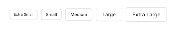
Size specifications:
| Size | Height | Text | Icon Size | Use Case |
|---|---|---|---|---|
xs | 32px | xs | 14px | Compact UI elements |
sm | 36px | sm | 16px | Secondary actions |
md | 40px | sm | 16px | Default size |
lg | 44px | base | 18px | Primary actions |
xl | 48px | base/lg | 20px | Hero sections |
Working with Icons
The button component automatically handles icon sizing and spacing:
<.button>
  <.icon name="hero-plus" class="icon" /> Add Item
</.button>

<.button variant="solid" color="green">
  <.icon name="hero-check" class="icon" /> Confirm
</.button>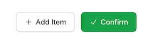
Icon Class Required
The icon class is required for proper icon sizing and alignment:
<.button>
  <.icon name="hero-check" class="icon" /> <!-- Correct -->
  <.icon name="hero-check" /> <!-- Incorrect -->
</.button>
Link Mode
The button can be rendered as a link while maintaining consistent styling:
<.button as="link" navigate={~p"/dashboard"}>
  Go to Dashboard
</.button>
When used as a link, it supports all LiveView link attributes:
navigate: For live navigationpatch: For live patcheshref: For regular navigation- Standard anchor attributes (
target,rel, etc.)
Real-World Examples
Primary Action
<.button variant="solid" color="blue" size="lg">
  <.icon name="hero-arrow-right" class="icon" />
  Get Started
</.button>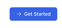
Destructive Action
<.button variant="solid" color="red" phx-click="delete_account" phx-value-id={@account_id}>
  <.icon name="hero-trash" class="icon" />
  Delete Account
</.button>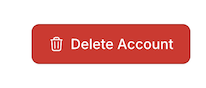
Navigation Link
<.button as="link" navigate={~p"/settings"} variant="ghost">
  <.icon name="hero-cog-6-tooth" class="icon" />
  Settings
</.button>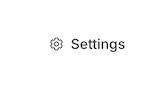
Summary
Components
Renders a button or link with customizable styles and attributes.
Components
Renders a button or link with customizable styles and attributes.
This component provides a flexible way to create interactive elements with consistent styling across your application. It supports various sizes, colors, and visual variants while maintaining proper accessibility and user experience standards.
Attributes
color(:string) - The color scheme of the button. Each color includes specific styles for all variants and maintains proper contrast in both light and dark modes.Defaults to
"default".size(:string) - The size variant of the button. Affects height, padding, font size, and icon sizing. Defaults to"md".type(:string) - The type attribute for button elements. Common values:button,submit,reset. Only applies whenasis set tobutton.Defaults to
nil.variant(:string) - The visual style variant of the button:default: Standard button with subtle gradient and bordersolid: Filled button with stronger visual weightghost: Borderless button with hover state
Defaults to
"default".as(:string) - Determines whether the component renders as a button or link element. Whenlinkis used, all Phoenix LiveView link attributes are supported.Defaults to
"button".class(:any) - Additional CSS classes to be applied to the button. These are merged with the component's base classes, variant styles, and size styles.Defaults to
nil.Global attributes are accepted. Additional HTML attributes to apply to the button element. Supports both standard button attributes and anchor/link attributes. Supports all globals plus:
["target", "download", "rel", "hreflang", "type", "referrerpolicy", "navigate", "patch", "href", "replace", "method", "csrf_token", "autofocus", "disabled", "form", "formaction", "formenctype", "formmethod", "formnovalidate", "formtarget", "name", "type", "value"].
Slots
inner_block(required) - The content to be displayed within the button. Supports text and icons with automatic spacing and sizing based on the selected size variant.